PageCub Blog
Beyond the Presets: 8 Unusual Illustration Styles for a Personalized Children's Book
August 19, 2026
PageCub includes a collection of illustration styles designed to cover a fairly wide range of children's books.
Warm watercolor. Bright cartoon. Whimsical fantasy. Minimal shapes. Soft painterly art.
For most books, one of those is probably enough.
But it does not have to be.
When you choose Other for the illustration style, you can describe the visual world you actually have in mind. And that can mean much more than make it watercolor, but a little darker.
The entire medium can change.
A book can look stitched from felt. Built from clay. Cut from torn paper. Assembled from stained glass. Carved into a printing block. Made from ceramic tiles.
The story stays the same. The visual language changes completely.
The eight styles in this post
Illustration style can describe a medium, not just a look
People often think about art styles in terms of familiar categories: cartoon, realistic, watercolor, anime, vintage. Those are useful starting points.
But another way to describe an image is to imagine how it was physically made.
Was it painted? Printed? Sewn? Cut from paper? Built from clay? Made from glass? That one decision can change almost everything else automatically.
A felt illustration has stitches. A linocut has carved marks. A mosaic has grout. A stop-motion miniature has tiny physical shadows. Those details make an image feel different before we even begin talking about color or mood.
To demonstrate, we used the same basic scene repeatedly: a child named Rowan standing outside a bakery on a rainy afternoon. Same child. Same red umbrella. Same little white dog. Same bakery window. Same bicycle. Very different books.
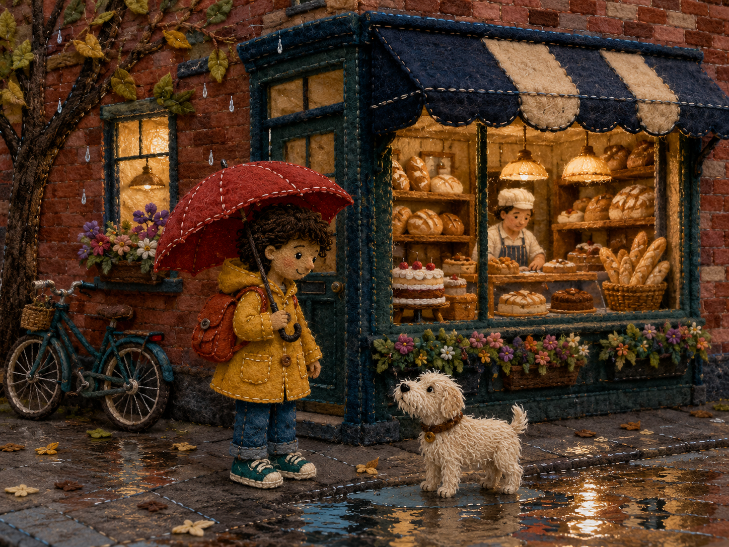
1. Embroidered Felt Storybook
Handmade · cozy · tactile · playful
Imagine the entire page sewn together from scraps of fabric. Hair becomes yarn. A raincoat becomes layered wool felt. Windows are stitched into place. Tiny flowers might be made from little loops of thread. Even the outlines can become embroidery instead of ink.
This style works particularly well when you want the book to feel as though somebody physically made it by hand. It can be charming for younger children, family stories, gentle adventures, animals, bedtime books, or anything where warmth matters more than realism.
Example style description
“Handmade embroidered felt storybook art, with every character and object constructed from layered wool felt and fabric appliqué. Visible blanket stitching, embroidered facial details, yarn hair, slightly uneven hand-cut edges, stuffed dimensional forms, and tactile fibers throughout. Use stitched outlines instead of drawn lines, fabric scraps for clothing and architecture, tiny buttons and thread details where appropriate, and soft textile shadows. The result should look like a lovingly handmade fabric picture book photographed flat, not a digital painting or smooth 3D render.”
The useful part is not the exact wording — it is the collection of visual clues: felt + stitching + yarn + fabric + handmade edges.
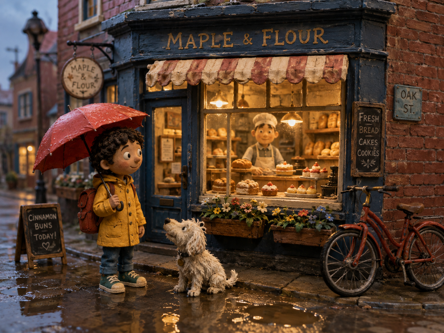
2. Clay Stop-Motion Miniature
Physical · charming · cinematic · slightly imperfect
Imagine the same story as a frame from a stop-motion film. The child is sculpted. The bakery is a tiny set. The clothes are miniature fabric. The bicycle is a prop somebody could theoretically pick up with two fingers.
That physicality gives the scene a very different personality. Perfect digital surfaces actually work against this style. Fingerprints, uneven clay, little seams, painted cardboard, and tiny imperfections are part of what makes the world believable.
Example style description
“Handcrafted clay stop-motion miniature style, with characters sculpted from slightly imperfect modeling clay and the entire environment built as a physical tabletop set. Visible fingerprints, handmade seams, tiny sculpted props, painted cardboard architecture, miniature fabric clothing, and practical lighting. Faces should be expressive but simple, with charming asymmetry and tangible material texture. Use shallow depth of field and real miniature shadows so the image feels like a frame from a lovingly handmade stop-motion children's film.”
This is a good example of why imperfection can be part of an art direction. Smooth is not always better. Sometimes the fingerprints are the point.
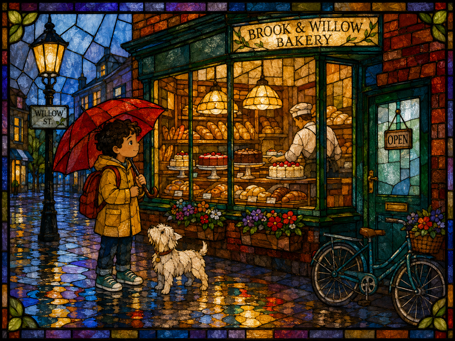
3. Stained Glass Storybook
Luminous · jewel-like · dramatic · decorative
Some styles change the surface of an illustration. Stained glass changes the way the entire scene has to be constructed. Everything becomes a collection of shapes — a coat, an umbrella, a face, a window, a puddle — separated by dark lead lines instead of soft shading.
Rain and reflections become geometric patterns. The result can feel elaborate without depending on tiny painted details. This works especially well for fantasy, legends, dramatic adventures, holidays, or stories where every page should feel a little ceremonial.
Example style description
“Decorative stained-glass storybook illustration, constructed entirely from luminous pieces of colored glass separated by bold dark lead lines. Simplify characters, buildings, rain, reflections, and objects into elegant interlocking glass shapes. Use jewel-like translucent colors, subtle bubbles and imperfections in the glass, glowing transmitted light, and strong graphic silhouettes. Faces should remain readable despite the geometric treatment. The whole scene should resemble a handcrafted storybook window illuminated from behind.”
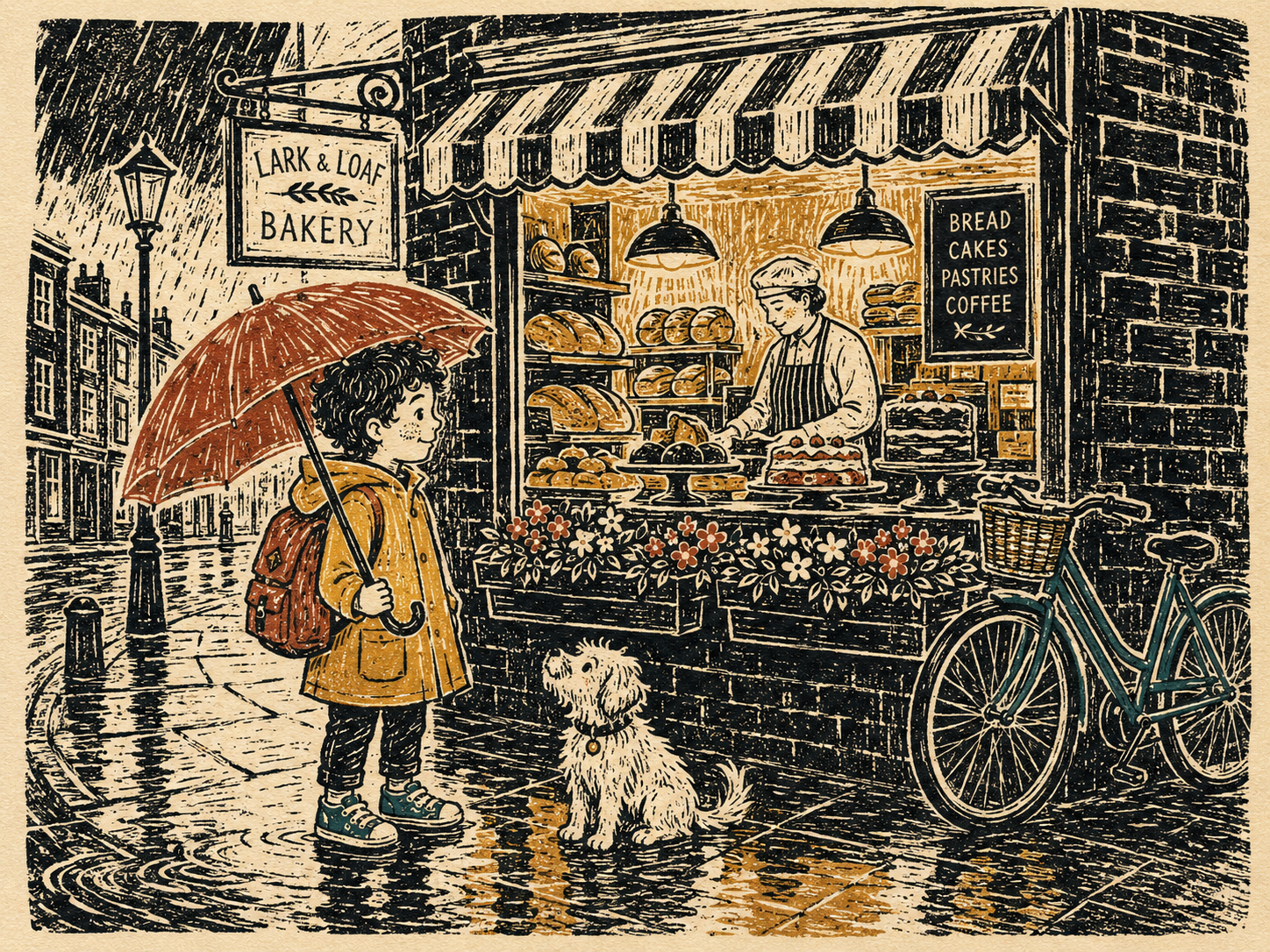
4. Vintage Linocut Children's Print
Graphic · rustic · handmade · old-fashioned
A linocut begins by removing material. The artist carves away the parts that should not print and leaves behind the shapes and marks that will hold ink. That produces a visual language full of bold contours, gouged textures, rough hatching, and little irregularities.
Smooth gradients largely disappear. A rainy street might be described through carved lines. A dark wall becomes a block of ink. A face needs only enough marks to remain expressive. This kind of art can give a story an older, folk-tale quality without requiring the story to take place in the past.
Example style description
“Hand-carved linocut children's-book illustration printed on warm textured paper. Use bold carved contours, irregular gouged marks, rough hatch textures, simplified shapes, and visible ink variation from the printing process. Limit the palette to black plus two or three muted spot colors. Shadows and surface texture should be created through carved lines and blocks rather than smooth gradients. The result should feel handmade, graphic, slightly rustic, and unmistakably printed from a carved block.”
This also demonstrates how useful a limited palette can be. Sometimes fewer colors make the visual identity stronger.
5. Torn-Paper Collage
Crafty · playful · graphic · imperfect
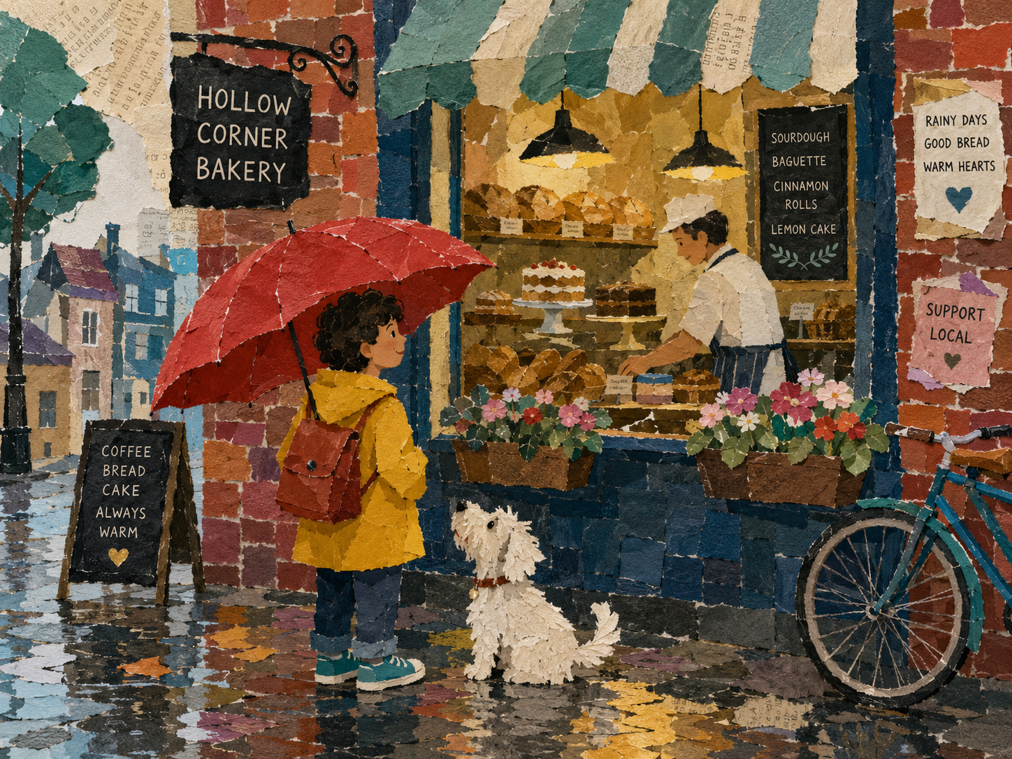
Paper collage works by reducing the world to pieces. A wall can be torn from textured red paper. A coat can be mustard construction paper. Hair can be several overlapping scraps. Rain can be thin strips of tissue. The little inconsistencies between those materials become part of the illustration.
This style is particularly good when you want something energetic and handmade without becoming visually complicated. It also works nicely for books about making, building, imagination, school, art, or creativity.
Example style description
“Flat torn-paper collage illustration made from overlapping pieces of textured construction paper, handmade patterned paper, tissue paper, newspaper-like fibers, and painted paper scraps. Every shape should show irregular torn or scissor-cut edges. Build characters and scenery from simple layered paper forms with minimal drawn detail. Use visible glue-like overlaps, mismatched textures, playful scale, and bold color relationships. Keep the composition flat and graphic like a handmade collage page rather than a three-dimensional paper diorama.”
6. Japanese Woodblock Children's Illustration
Restrained · rhythmic · elegant · atmospheric
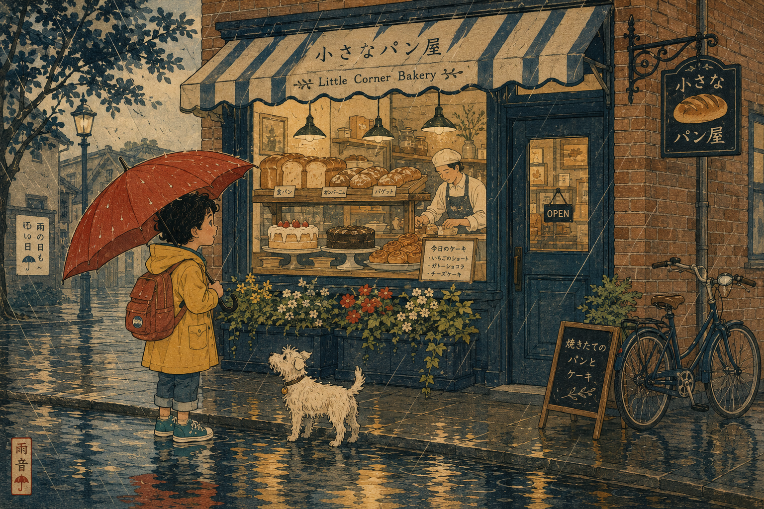
Not every custom style needs to become louder. Some become quieter. A woodblock-inspired illustration can use broad areas of color, flowing contour lines, flattened depth, visible paper, and carefully controlled negative space.
Rain can become a repeated pattern of diagonal marks. Water can become a few elegant shapes. Architecture can become simpler and stronger. Instead of trying to render every physical detail, the picture decides which details actually matter. The page does not have to contain more things to feel richer — sometimes it needs fewer.
Example style description
“Traditional Japanese woodblock-inspired children's illustration with elegant flowing contour lines, flattened perspective, broad areas of restrained color, subtle handmade paper texture, and delicately patterned surfaces. Render rain as rhythmic diagonal lines, reflections as simplified flowing shapes, and architecture with strong graphic geometry. Use an understated palette of indigo, muted teal, ochre, rust, cream, and soft gray. Avoid photorealistic shading; let line, pattern, silhouette, and negative space carry the image.”
7. Ceramic Mosaic
Tactile · colorful · permanent · unusual
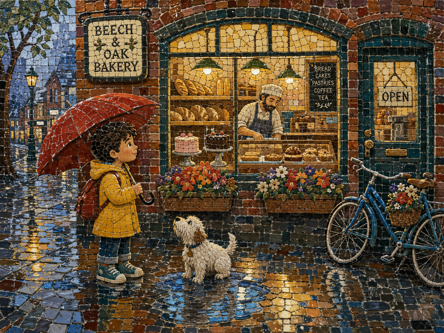
Take the scene off the paper entirely. Imagine it installed on a wall. A mosaic creates an image from hundreds of small pieces — faces need tiny fragments to preserve expression, large walls can use bigger tiles, curves become little stair-steps of ceramic, and grout becomes part of the drawing.
This is probably not what most people mean when they first think children's-book illustration. But the story does not care whether its world was painted with watercolor or assembled from little glazed tiles. As long as the reader understands the picture, the visual language can become surprisingly strange.
Example style description
“Handmade ceramic mosaic storybook illustration assembled from hundreds of small glazed tiles and irregular ceramic fragments. Characters and scenery should remain clearly recognizable while being constructed entirely from individual tesserae with visible grout lines. Use glossy colored glazes, occasional crackle texture, imperfect handmade tile shapes, subtle reflected highlights, and larger pieces for simple areas with smaller tiles around faces and important details. The finished image should resemble a whimsical narrative mosaic installed on a wall.”
8. Ink Wash With Selective Color
Quiet · poetic · atmospheric · expressive
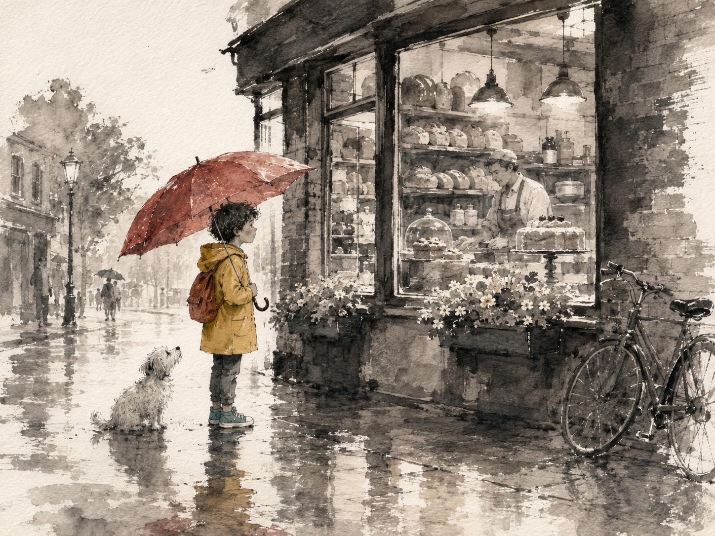
Custom does not always mean elaborate. Ink wash can do almost the opposite. Most of the page can remain black, gray, and the natural color of the paper. Buildings fade into loose brush marks. Rain becomes washes and streaks. Background figures may barely exist.
Then one or two objects carry color. A red umbrella. A yellow raincoat. Perhaps the warm light inside the bakery. Those few colored details suddenly become much more important because everything around them is restrained. This can work beautifully for reflective stories, older readers, family memories, rainy days, and quieter emotions.
Example style description
“Expressive monochrome ink-wash storybook illustration on textured natural paper, using loose flowing brushwork, pools of diluted black ink, dry-brush texture, and generous negative space. Most of the scene should remain black, gray, and paper-white, with only two or three carefully chosen objects rendered in muted color for emphasis. Forms should feel spontaneous yet controlled, with atmosphere suggested rather than fully described. Elegant, quiet, poetic, and visibly handmade.”
The important part is visual grammar
You do not need to write descriptions this detailed when making a PageCub book. These examples are intentionally specific because they demonstrate what is possible.
The useful trick is to describe several parts of the same visual idea at once. Instead of make it handmade, you might say: cut paper, torn edges, visible fibers, overlapping scraps, flat collage. Instead of make it vintage: carved linocut marks, warm paper, black ink, two muted colors, rough printing texture.
Each extra detail gives the style a little more structure. You are not really writing an art prompt. You are describing the rules of the visual world.
Medium is one of the easiest places to start
If you want to invent your own style, begin by asking: What is this picture made from?
Watercolor? Charcoal? Fabric? Clay? Paper? Glass? Woodcut ink? Colored pencil? Ceramic? Chalk?
Then ask a few more questions.
What do the edges look like?
Clean? Torn? Stitched? Carved? Soft? Geometric?
What happens to color?
Bright? Muted? Only three colors? Almost entirely monochrome?
How much detail belongs in the world?
Sparse? Dense? Tiny things everywhere? Lots of empty space?
How should it feel?
Cozy? Funny? Strange? Old? Quiet? Grand?
A few answers usually begin pointing in the same direction.
You can mix ideas too
Nothing says a style has to fit neatly into one historical or artistic category. You might ask for:
- colored-pencil drawings on graph paper
- felt characters inside cardboard sets
- black-paper silhouettes with glowing tissue-paper backgrounds
- chalkboard drawings with selective pastel color
- antique scientific diagrams of imaginary creatures
- patchwork quilt illustrations
- retro travel-poster art for a fantasy world
- charcoal drawings with one bright watercolor accent
The important thing is that the pieces make sense together. Specificity helps. Contradiction usually does not.
You do not need to know what the style is called
This may be the most useful part. You can have a very clear picture in your head without knowing the correct art-history vocabulary for it. That is fine. Describe the thing.
“It should look like somebody stitched the whole book from scraps of old fabric.”
“I want it to look like tiny clay characters photographed on handmade sets.”
“Almost everything should be loose black ink except her red umbrella.”
“Make it look like the pictures were assembled from broken glazed tiles.”
The name of the style matters much less than the description of what should actually appear on the page.
The presets are starting points, not walls
The preset PageCub styles exist because most people do not want to spend twenty minutes art-directing a children's book. Sometimes you just want warm watercolor. And that is enough.
But sometimes the visual idea is part of the reason you want to make the book in the first place. Maybe a child loves crafts. Maybe a grandparent quilts. Maybe the story is a family memory and black ink feels right. Maybe the child has decided that their adventure absolutely must look as though it has been constructed from tiny pieces of stained glass.
That is what Other is for. The goal is not to make every book visually strange. It is to leave the door open when strange is exactly what the book needs.
Because a personalized story does not only have to be about a particular child. It can look like it belongs to them, too.